Improving self serve rate for business loans
Context
Razorpay capital
offers credit products to its users such as Line of credit, corporate credit card &
Loans.
To avail credit, users must fill in an online application and share the
necessary documents.
Problem statement
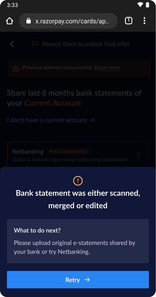
The bank statement onboarding stage currently experiences a 51% drop-off rate, creating a critical bottleneck in the lending funnel. This is driven by a reactive validation loop and a lack of real-time user guidance, which forces manual intervention and prevents applicants from presenting the financial data necessary to qualify for higher credit limits. Consequently, these inefficiencies directly suppress Average Ticket Size (ATS) and stall the growth of the overall lending book.
Solution summary
The solution targets
the critical areas that the problem statement highlights
Clear communication of
requirements.
Realtime feedback (within 30s) on uploaded statements.
Re-designing
the loan offer screen to celebrate the user’s efforts.
Impact
1x Product Manager
2x FE Engineers
2x BE Engineers
Solution details
#1 Simplifying the bank statement screens
The first part aims at creating a simple and straight forward bank statement collection experience for the users. This involved redesigning the screen as well as the copy.
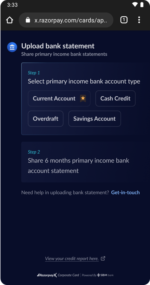
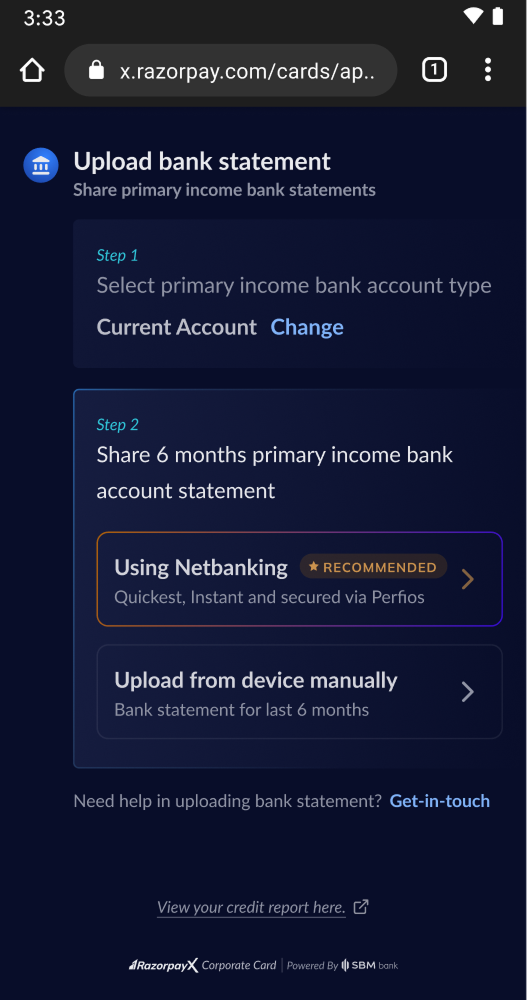
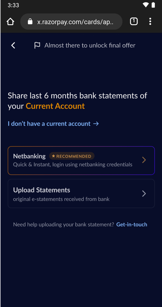
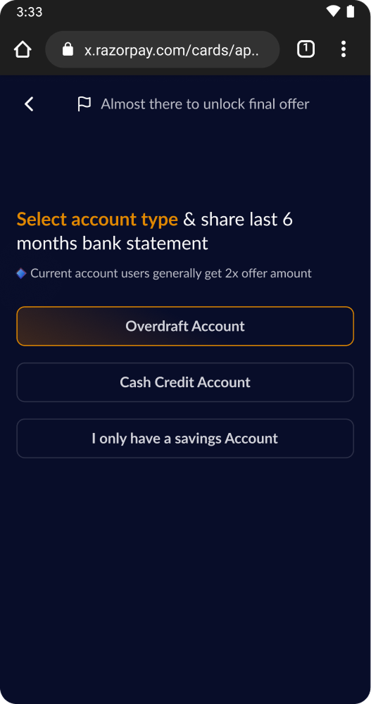
1.1 Account & method selection
1.2 PDF Upload screens
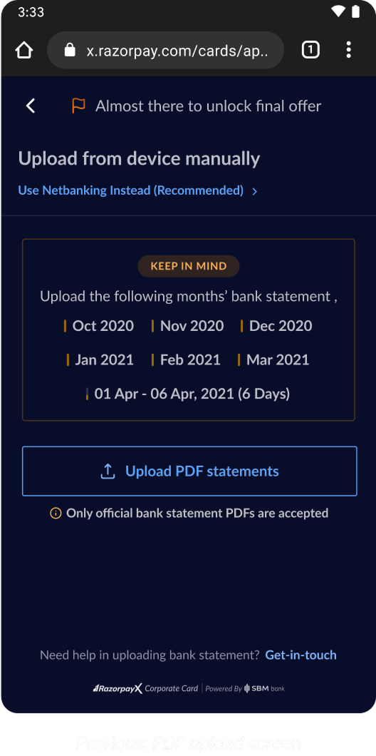 Before
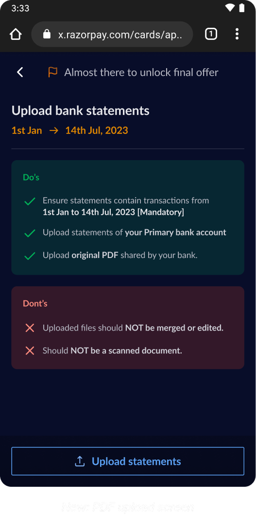 After
After
#2 Providing feedback in realtime
This is where our back-end does the heavy lifting to process the bank statements in realtime and ensure the rule engine is able to churn out an offer for the user within 30 seconds (given all requirements are met)
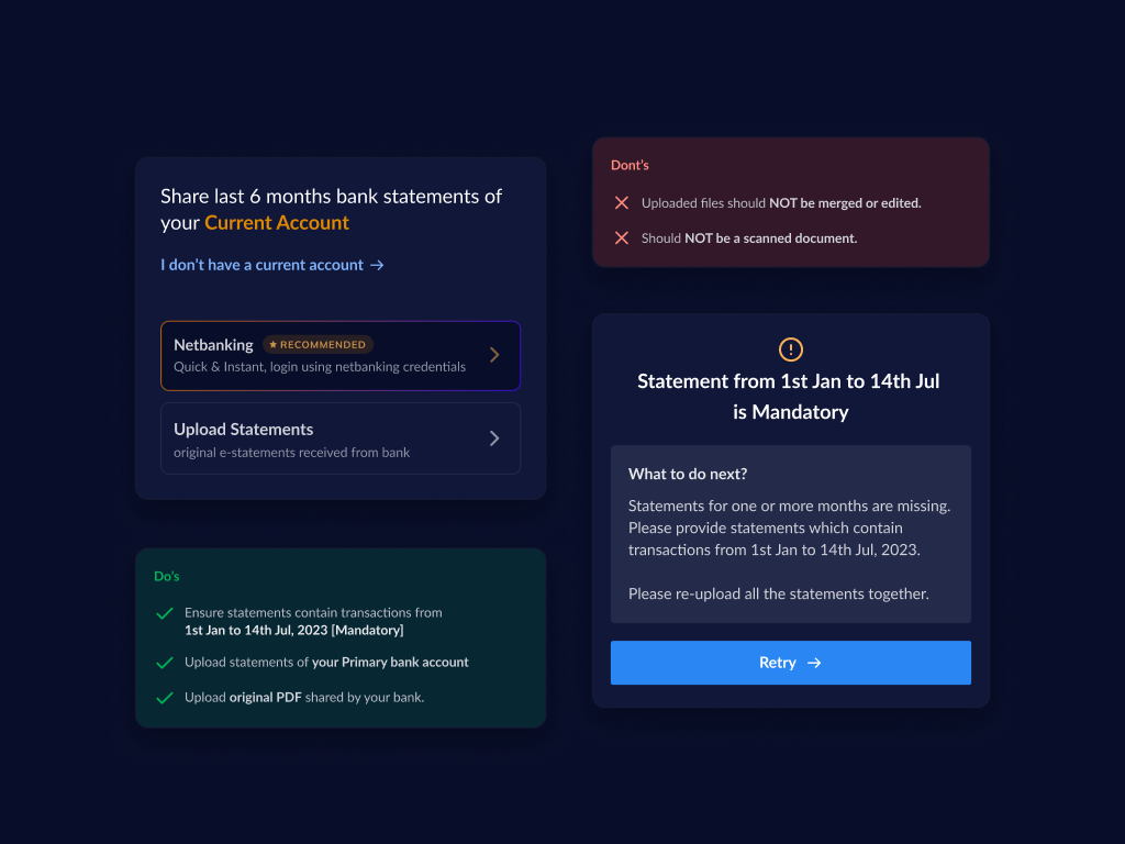
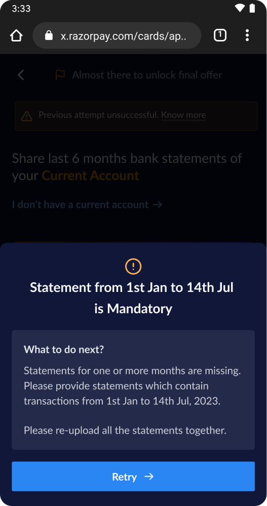 Real time feedback - missing
dates
Real time feedback - missing
dates
 Real time feedback - duplicate
file
Real time feedback - duplicate
file
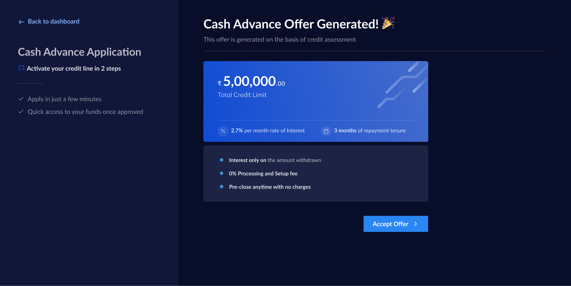
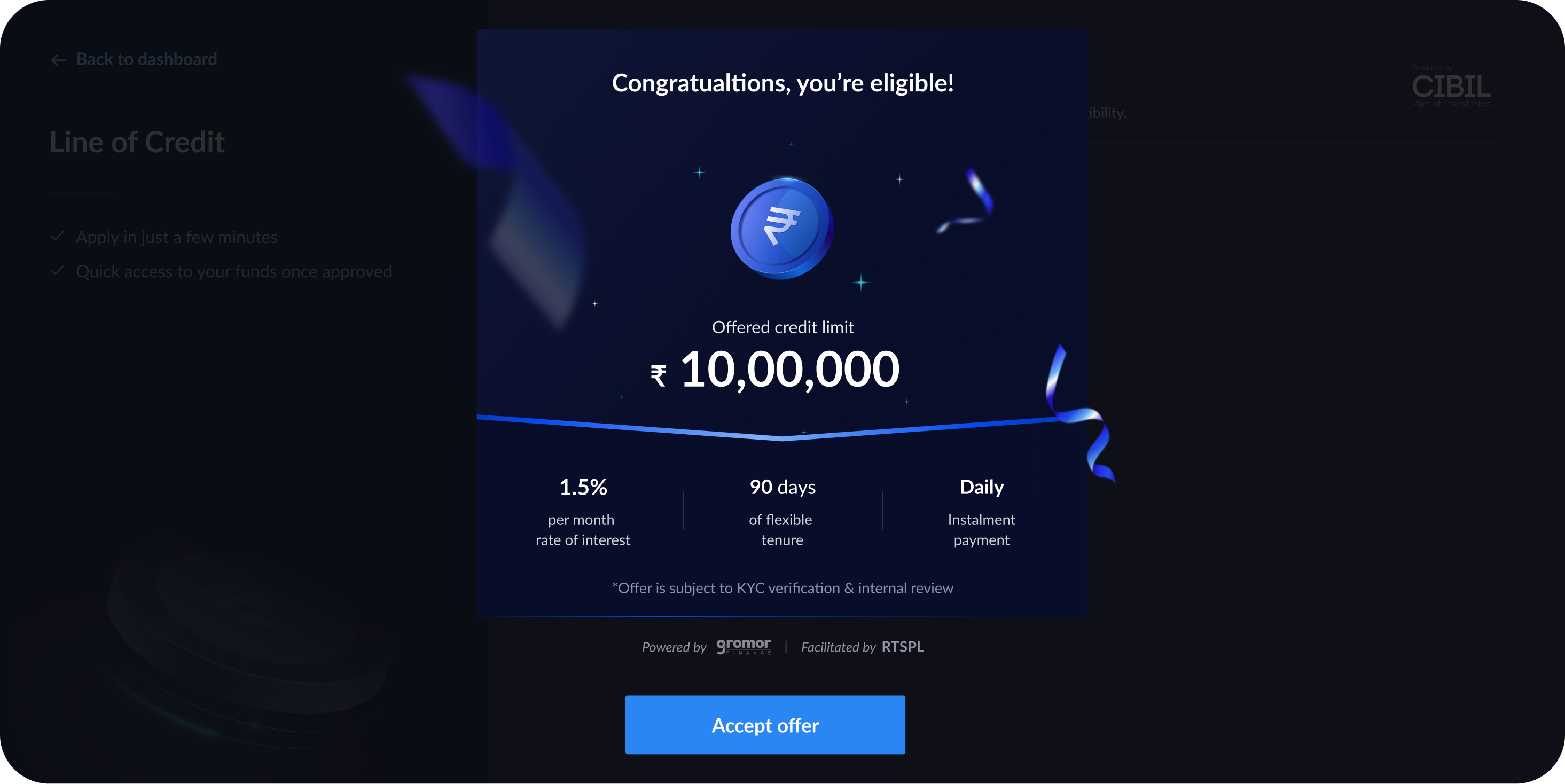
#3 Redesigning the offer screen
~70% of the users drop-off by the offer step. In-order to be truly self serve & increase ops and sales efficiency, the onboarding journey had to be simple & delightful.
The goals for this redesign were to ensure
Offer details are upfront & easy to consume
Looks dynamic & gives a celebratory feeling
Doesn’t distract the user from the task at hand
 Before
 After - Desktop